“Losing 80% of your screen space forces you to focus. You need to make sure that what stays on the screen is the most important set of features for your customers and your business. There simply isn’t room for any interface debris or content of questionable value. You need to know what matters most.”
Choosing the right web template is a truly daunting task. Drupal themes, Joomla templates, WordPress templates, you have to choose the right one for your needs, and your customer’s needs. Now, recent trends in the industry have led to the intense popularization of 5 web templates. These are:
1. WordPress Themes
WordPress themes are, as you’ve probably already figured out, just that. Themes especially made for the WordPress platform. The theme is more than just a face-lift, it’s about look and presentation, being able to include custom image files, style sheets and even code files.
2. Joomla Templates
Joomla templates come in 2 variates. One is the Front-End template, which is all about the way a visitor experiences the site and interacts with it. It’s what get’s the traffic growing.
The 2nd variety is the Back-End template. It’s basically what’s “under the hood” of your website, and what you’ll be seeing most of, as an administrator.
3. Drupal Themes
Drupal is an open-source Content Management System. Being open-source and, as they advertise themselves, easy to use, it is highly customizable. This lead to the appearance of a really rather generous number of themes available online.
4. Magento Themes
Magento has been created with online stores in mind. It has the designer’s best interests at heart, allowing you to keep separate templates for the products you have posted and the general look and feel of the store (which you can change in just a few keystrokes for seasonal events).
5. OsCommerce Templates
Another online store oriented interface, OsCommerce is different from other ecommerce software because it uses the JQuery Theme Roller theme builder in the creation of its themes. It allows both Catalog and Administration Tool customization, earning it the 5th spot on this list.
These are all classic templates, having been used for a fair number of years in the creation of websites. But there is a young contender, giving them a good run for their money in the world of website templates. This rising star of web design is the One-Page template, a HTML5 based template that gives your site a fresh and unique look that will definitely make it stand out.
In order to know if One-Page websites are for you, we’re going to present a list of 5 pros and cons for using a One-Page template. This way you can get a better idea about this kind of template, and know when to use it.
Pros and Cons
Pro 1: Like we’ve mentioned above, One-Page templates are stunning. They look gorgeous and they make real good first impressions on users.
Con 1: It’s easy for the user to get bored of the site. If he wasn’t planning on spending a lot of time on your site, there’s a definite chance he’s going to loose interests.
Pro 2: If your web page gets a page rank from Google, than it’ll be relevant for the entire website.
Con 2: It’s hard to optimize your SEO (some say impossible) for more than a few words on a One-Page website.
Pro 3: It’s easier to design than multiple-page templates.
Con 3: Loading times can be quite slow, because of all the effects used to make One-Page templates as pretty as they are.
Pro 4: It’s easier to optimize One-Page websites for the mobile
Con 4: It’s a lot more difficult to update that ordinary, multiple-page websites.
Pro 5: Because of the rise of social networking, and sites like Facebook and Twitter, user-scrolling habits have changed drastically. One-Page templates suit these new patterns perfectly.
Con 5: You can’t get as much information from Google Analytics for One-Page templates, as you can for the multiple-page kind.
Now, knowing these things, it’s time to show you 20 of our favorite One-Page websites to help you visualize if you plan on making one yourself.
 Calls us big softies, but we enjoy a good love story now and again. The Story of Jess and Russ is an adorable wedding invitation (for whomever has the RSVP code), and an equally adorable story that you can experience through the medium of browsing.
2. The Interactive Resume of Robby Leonardi
 One-Page websites are really all about purpose. That’s why Robby Leonardi’s interactive resume is such a brilliant website. What could have been a PDF, detailing your professional career and aspirations in a very impersonal manner, has been made a fun website, that also showcases Robby’s web and graphic design skills.
3. SmartPhood
 An interesting project, SmartPhood is about people’s eating habits. It’s design is nice, tidy and playful, and it also gives you some really interesting insight into how the project worked and what results they got.
4. numéro10
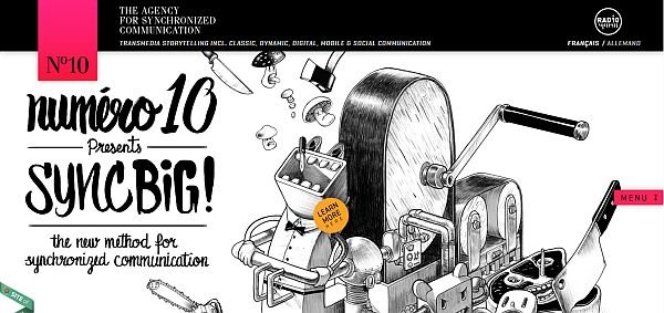 This website is absolutely mind blowing. Layers upon layers of transition effects and parallax scrolling, and it all runs so fluidly. Really a fantastic website.
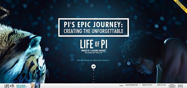 The Life of Pi is an Academy Award winning movie. It’s even impressed James Cameron for the way it looks, and that’s saying something. The website looks just as good as the movie, with the added bonus of being an interactive “making of”.
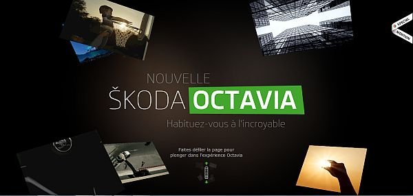 Anything in French sounds better. The new Skoda Octavia’s site does a really good job in using the One-Page template to create not just a website, but an experience.
 The issue of water as a finite resource is a very serious one. Every Last Drop intends to bring attention to this issue through a well-designed, responsive website.
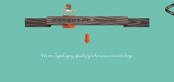 Reverend Danger are an advertising company that know how to advertise themselves. Smooth, fun design that blends really well with the parallax effects.
9. Activate
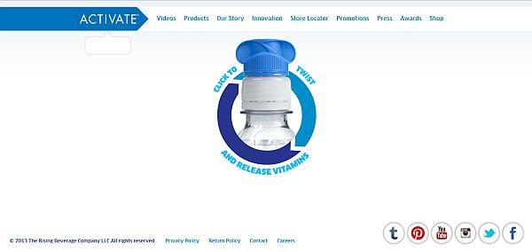 Just as dynamic as a TV commercial, at less than half the price. This highlights the strengths of One-Page websites.
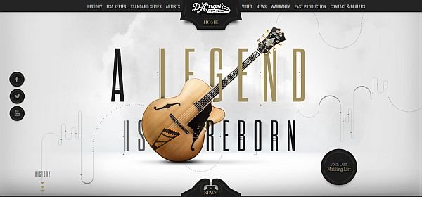 A real nice concept, elegantly presenting the company’s biography in highlights, with the option of reading more about it. Plus, guitars are awesome.
11. Marco Rosella
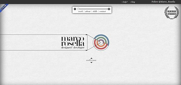 Yet another One-Page website portfolio, this time from Marco Rosella. It’s cool and minimalistic, much like Rosella’s work.
12. VonDutch
 Quite possibly the founding father of car culture in America, if not the world, VonDutch has a site almost as their legacy.
13. Renault Zoe
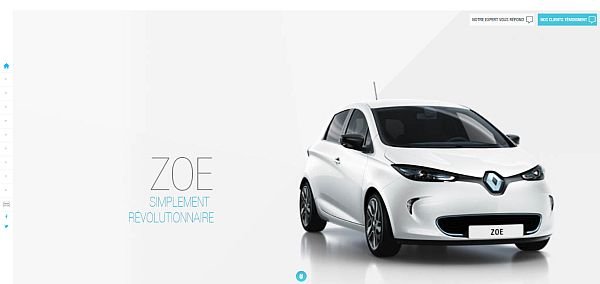 Car manufacturers have really gotten the hand of One-Page templates. Renault Zoe’s website is on par with TV ads.
14. My Pizza Oven
 This Dutch pizza parlor’s website does and excellent job in making you hungry, and sparking and interest in pizza ovens.
15. EVO Energy: The Interactive U.K. Energy Consumption Guide
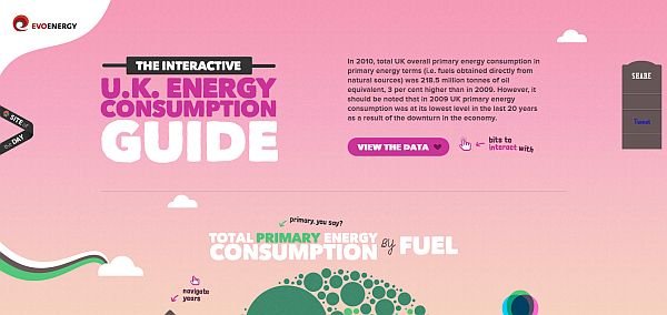 The U.K. are really spearheading the struggle to raise awareness on ecological issues. EVO Energy’s interactive energy consumption guide really makes all the information you get from it stick in your head.
16. Trionn Design
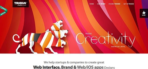 A design agency’s site should reflect what that design agency can do. Trionn Design’s website does a splendid job at showcasing just what the company has to offer.
 Fruit are good for you. Everybody knows that. It’s just that, sometimes, you need a little incentive to eat fruit, rather than chocolate. This site is just that incentive. It looks really nice, and it also gives you some interesting facts about fruit.
18. Marty.com
 A big name like Martin Ringler couldn’t have been caught off-guard with a sub-standard site. His One-Page website is a well designed, serviceable portfolio. Catches the eye just enough to let the achievements do the talking.
19. Sergio Pedercini
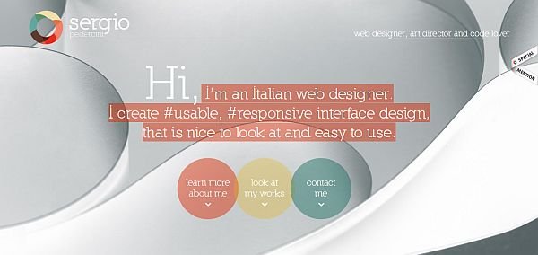 Italian design is just one of those things you want to hear when describing how something looks. Sergio Pedercini’s One-Page website curriculum vitae makes you understand why.
20. Quechua
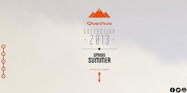 Quechua understands it’s customers. People who love hiking, nature, and adventure. Their site makes you want to put on you backpack, find pic a direction, and go see where that direction takes you.
We hope you enjoyed our list of amazing One-Page websites, and that it’ll help you get inspired for creating your own. Share the One-Page website you like with us and the other readers, in the comment section bellow.


Leave a Reply