Personal computers evolved into smartphones, and they further transformed into wearable. Now as technology is growing leaps and bounds, you being a designer needs to hone your skills to cater incredible user experience.
 To be an ace developer, you need to follow the trend to cater your audience seamless browsing experience.
Colors
As per a survey from webpagefx.com, 84.7 % of people say that they look for color before purchasing a product. Apart from this, 52 % of the people do not wish to return to a store if they do not like the aesthetics of the store. This implies that colors have a deep cognitive impact on users, and they strongly affect the purchasing decisions of the users.
Though people give a lot of preference to colors when it comes to selecting apparels or accessories, you need to make sure that the development can be the most of all the developers
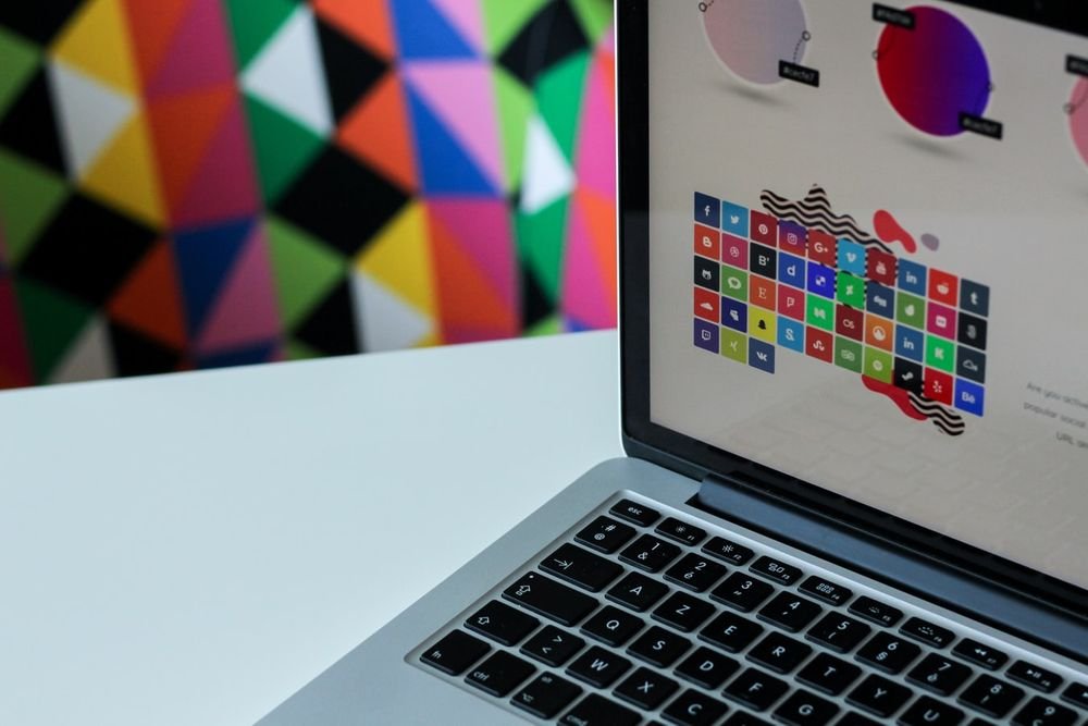
The designer has become more experimental with colors. Now they are using bright hues and pastels a lot, and making the background plain and simple is no more a trend.
Reduction In Page Height
There came a trend that introduced parallax design as the most upcoming trend. However, now the most trending thing is now people are focusing more on keeping the height of the page shorter. The is indicating towards the fact that vertical scrolling will tend to grow more and clicking will be less.
I believe that scrolling is quite easier than clicking, but portraying the complete website through scrolling is not such a good idea as per me.
Clicking is not a bad idea at all if you can understand your goal very deeply. To make your clicking appear quite appealing, you need to combine it with a modern design of front-end programming and micro experience. It is not palatable to make a website where people have to scroll a website that has 50 pages.
Flat and Material Design are Upcoming
Gradient became obsolete, and flat design came into the trend and on the top of it, the most important thing was that Google launched a complete guideline for material design. It was primarily not something very drastic which was needed but just because we were bored of the old techniques.
In this one gradient is removed by choosing a color and simply using it across the whole element.
The flat design came into the picture after the introduction of Android 5.0 and iOS 7/8, and this all started with mobile devices.
Android is the major contributor in bringing the trend of flat design into a picture as it was the one that introduced material design pattern. This is extended to desktop applications as well.
In this design style, we make use of intentions, motion work, white space, and shadows to give a very structured and layer technique to deliver 2D/3D look.
Further, the card layout approach makes it easy for the users to assimilate the content easily in one go. Though it is one of the most in-demand design trends and it is adopted by biggies such as Mashable, Pinterest, and other famous websites, it will eventually evolve in something better. Talking about White Spaces, they will play a crucial role in the coming future.
Further, it is expected that minimal and classic design will be reckoning force considering the frequently changing shapes and orientations of the devices. Further, parallax design trend will also come to an end, and the big photography images will continue in the web world. Designing a clean website is accepted nicely from the users, and this will continue to deliver good services till something very new enters.
Focus on Typography
Words are certainly the most crucial part of web development as they directly convey the message that your business wished to communicate. As the web is progressing fast, we can see that the design is also evolving constantly. We now have Google Fonts and many other new designers that have entered into the web designing world.
At such a highly competitive level we can now see that the designers are now putting utmost precision in choosing fonts, sizes, and weights of the term. Those who are highly focused websites have already started designing in this way. Typography certainly has a deeper impact on the users brain and thus, must be chosen with utmost care.
What’s The Trendiest?
Well now as we are moving to the progressive web we now need an equally competent design to catch hold of the users. Every time a new trend comes in, I just get curious to know what’s next and what future has in store for web design trends of the future. What kind of design typography will be used and what will be the level of interaction with the mobile apps? Well, it tickles your nerve in finding what will future bring and at what level we will be competing to deliver excellence.
Author Biography:
Samuel Dawson is a viable developer in Designs2html – a PSD to HTML5 company. The above article is summarized in a manner with some secrets which are coming in 2016 especially in web design and development industry.


Leave a Reply