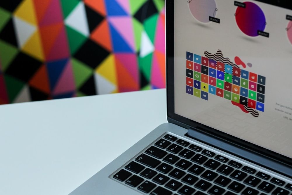
 Web Design trends are constantly evolving. Like clothing or hairstyle fashion change over time, so do web design practices. If you compare current websites to those from a few years ago you’ll notice a number of changes with regard to styles, colors, patterns and the overall aesthetic quality. Backgrounds of websites too have changed enormously, with the recent looks becoming more bold and striking.
As their name suggests, backgrounds occupy a subtle place on a web page behind the text, images and the main content. But a background is also capable of being the sole attention-grabbing element in a website. It basically depends upon what you choose to do with it. But a background covers the entire page and contributes greatly to the overall look of the website, often times being the first thing your eye falls on. Thus, great care has to be given to the selection of the right background for your website
The background of a website is instrumental in deciding the tone of the website. The possibilities for the choice of background are endless, each one better than the other. While there are no rules to aid you in choosing the right background, in order to make the correct selection for your website, you need to understand some factors contributing to it.
- The background style you choose should complement your brand image and the general theme of the website.
- Backgrounds should not download slowly and cause the website to lag.
- Most importantly, make sure that the background that you choose doesn’t overpower the content of your website and make it unreadable.
Now we can look into some of the current practices in background design. With the changing times, backgrounds have become more integral to the total layout of the website and now occupy a key position in grabbing the attention of visitors.
Solid background colors of course are still widely popular. The difference is that brighter, bolder colors are now being used in addition to the classic black and white providing a dramatic effect and instantly catching the eye. Using a dark colored background can add depth to your website and two contrasting colors can make an interesting background that provide a refreshing change.
Using sharp images that cover the entire background is a relatively new trend that seems to be quite a hit. Instead of using images on other backgrounds, it is now perfectly acceptable to use the pictures alone as backgrounds. Of great importance is the quality of the image. Pictures straight out of nature make a great impact.
Many web designers have started to go for the faded and blurry effect for their background. A sharp image, when blurred or faded can be used creatively as a background depending upon the theme of your website. The style can range from a mild blur to a more dramatic fading of the picture.
The patterns and textures used as website backgrounds are also becoming bolder with designers going for bigger prints and brighter colors. You can give your textures depth by playing around with hues and breathe a sense of life into them.
Keep in mind that the best backgrounds are ones that exude their presence by instantly drawing focus but also complement the rest of the website.


Leave a Reply