When the users first land to the mobile app, do you know the first thing that tells them a complete story? Do you know the thing that filters the unnecessary so that necessary can speak?
Do you know the first thing that makes the app memorable and invites them again to look at? Do you know the thing that acts as middlemen between information and understanding?
It’s a DESIGN.
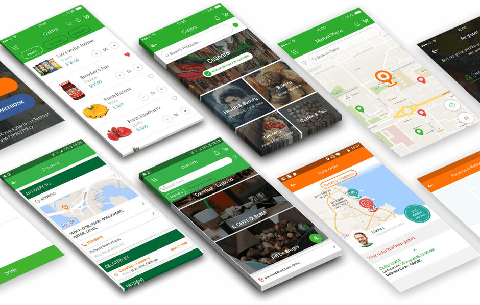
The mobile app design is a great trademark that distinguishes the app and makes it unique in the sea of apps. Saying design is the intelligence won’t be hyperbole because not all the apps delight the users. Some apps suck due to poor design and that’s where the designer has not left anything to add, but the design techniques are missed.
Considering the app design just a style is also wrong because the design is a language that speaks a ton while staying synced with the style, design principles, design practices, and target users. It’s clear that design is a vital part of the mobile app development which lets businesses conquer the various screen sizes and stay successful.
Here’s the summary of the plenty of recommendations which should be incorporated while app designing to make the app stand up-to-the-par:
1. Declutter the design
Overloading the interface with so many images, buttons, and icons make it complicated, and it looks worse on the mobile screen because of the limited real estate. It negatively impacts comprehension as well. The best practice includes keeping the important content, and minimum elements on the screen, and if required, then progressive disclosure technique can be used to show multiple options.
2. Don’t add an extra learning curve
The users are using the app to make the tasks done at speed. They don’t want to learn anything. When the unfamiliar screens, controls, buttons, or icons are leveraged, the users get confused and require to learn what they are conveying. The associated learning leads to frustration and often results in app abandonment. It’s good to use the design elements that have become a de facto standard for the users and let them interact with the app using the previous app browsing experience.
3. Minimize the user input
The concept of task offloading applies to registration forms, checkout page, or other types of forms filling. At first, typing on mobile is error-prone and second, it requires the user’s effort, which never renders good experience.
The process of filling a form can be made easy by keeping the minimum number of fields, breaking the tasks into small chunks (The step-by-step checkout process), using field masking that automatically format the text, implementing autocomplete feature (Address filled automatically based on the user’s location), ensuring the field values are validated instantly, and displaying a customized keyboard for typing query.
4. Maintain Consistency
While using conventional design elements, the mobile app design company commit a big mistake of not using the visual and functional elements consistently throughout the app and in the complementary website. It creates confusion because the users may find the meaning of design elements differently. It can be eliminated by using the similar typefaces, buttons, labels, and interactive elements consistently across the app and external products so that transition between different pages of the app or app to external websites becomes seamless.
5. Make it accessible
You cannot guarantee that the target users are not suffering from vision loss, hearing loss, or other disabilities that can impact the interactivity with the app, if the app is not optimized for such accessibility needs. For instance, the users with color-blindness problem cannot distinguish between colors so visual signifiers are used in the app in addition to color effects to communicate the information and let them easily interact with the app.
6. Navigation should be simple
The brilliant features and compelling content can’t appeal to the users if they are unable to discover them effortlessly. You risk losing the users due to poor navigation structure. In order to let the users explore the app innately, use the familiar navigation patterns, decide priority levels in the navigation structure based on the usage, highlight the current location at the top of the interface to let the users know where they are, and gestures can be implemented to reduce the efforts required to discover anything.
7. Don’t overlook onboarding experience
The first impression is the last impression, which makes it extremely important to focus on the first-time experience. It includes a couple of things:
The mandatory registration before using the app is like compelling the users to buy fruit without tasting it that they have even never seen earlier. Let the users experience the app for some time and then ask them to create an account.
As a part of a good onboarding experience, provide the instructions or take them on an interactive tour only when the users want it. Start with an empty state where the users can be informed about the content to fill and they get to learn how to use the app.
8. Make it fast and responsive
It’s an age of impatience where the page loading time when extends 2 seconds, the users move to the competition, regardless of what the issue was- poor internet connection or operation taking a lot of time. Keep the app performance on the top of the priority list and make the app offers a pleasing experience by filling the screen with the content as the page loads, don’t include heavy designs, showcase loading spinner when the app gets frozen so that the user can estimate how long they have to wait, and add visual distraction such as animated waiting indicator that retains the user’s interest while waiting.
9. Content optimization for mobile
The UI is not all about design elements, the well-crafted content also plays a significant role. Keep the text readable and understandable with optimum font size, color contrast, limited text per line, and avoiding making all letter in caps. The HD-quality images should be used that appear in the right aspect ratio with no distortion on any type of device screen. Often overlooked, but the video content must be optimized for portrait mode.
10. Adapt to the market trend
The mobile app development company cannot afford to ignore the varying experiences and expectations of the users, especially when the app targets the global audience.
For instance, still, in many countries, the internet connectivity is little-to-none so the app must be optimized to work under varying internet conditions through data caching, reduced image size and diminished content size. Considering the expensive mobile data issue in some countries, the app should stay transparent in terms of data consumption by apps. The app must be designed to work on devices with limited storage and small processing power.
About The Author:
Nasrullah Patel Co-founder Peerbits, one of the leading Top mobile application development company the USA, in 2011 which provides Blockchain app development services. His visionary leadership and flamboyant management style have yield fruitful results for the company. He believes in sharing his strong knowledge base with a learned concentration on entrepreneurship and business.