With the arrival of the present year, Web Design Trends have undergone a radical change as the configuration of the devices to access the website also improved. Due to advancement in technology, the designers are updating the structure to make the web pages more relevant and optimized. Ancient habits of creating the layouts are discarded and new strategies are adopted. So, let’s find out the Old Web Design Trends that are no longer in use.
Sliders with Call to Action:
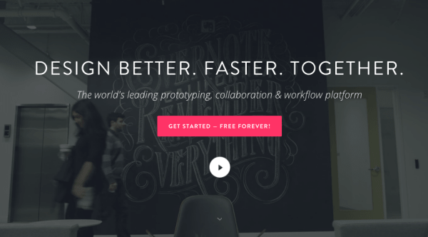 Sliders should be user-friendly with simplistic content. People do not expect the message to pop up in the most unlikely place because it annoys them instead of acting as an element of surprise. In some cases, the scrolling is so fast that people completely miss the message. In fact, only a few users click on the slider to analyze the content.
If the section keeps rotating, it can lose the valuable space. Some of the other aspects that can go wrong are there is no clear call to action and too many frills without substance. Instead of placing on the slider, the message should be positioned on the page.
Huge Images: Are they necessary?
 Websites had a tendency in the past to incorporate the array of pictures on the page. Instead of incorporating the picture or button without any purpose is bound to have the detrimental effect on the business aspect of the website. One can use the image however care should be taken that they are placed at one end of the monitor instead of occupying the central place.
Some companies provide single services so they focus on a solitary message nevertheless other provide a range of options to the clients. In such a case, the primary objective should occupy a major part of the website and others are also incorporated at suitable positions as more than 40% of the web traffic for allied services.
In short call to action is minimal however the rest of the content in imbibed into the link placed below.
Non-Intuitive Graphics:
 In the past decade, restaurant and lifestyle websites had huge buttons as they looked unique. They have inundated with every possible color but the real casualty was content. Due to the incompatibility of the foreground and the background, users were not able to access the information they were looking for. In order to rectify the problem, flat design was introduced by the companies however designers overdid them. As a result, users were not able to differentiate between the buttons of different textures. In fact, interactivity completely disappeared from the web page.
As a part of the new web design trends, three-dimensional environment strategy is being implemented that uses thickness and the shadow to create a surreal experience. Due to accessible design, visitors can now navigate through the web pages without any hassles. Some websites use hover effect and shading to highlight the numerous components of the web page.
Hamburger menus are out:
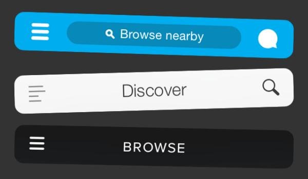 Hamburger menus that were fad once upon a time are totally out of fashion in 2017. Majority of menus on the mobile compatible websites are so tiny that they cannot be accessed on a laptop due to poor visibility. Navigation is hidden in the mobile version as it takes lots of space. If the required link is not available, users might get frustrated and it could result in a decrease in the web traffic.
Sidebars designs are not hot:
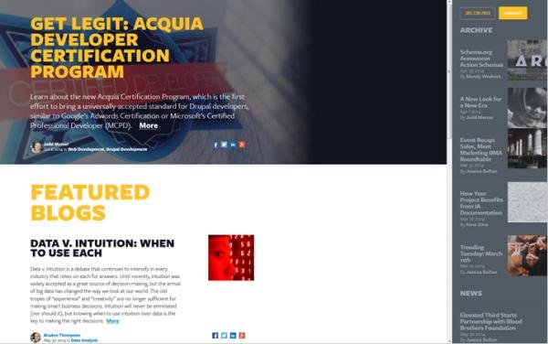 Sidebars are user-friendly but they are not effective especially if you are creating service page as people have to scroll down to access the required information. In addition, internal links and buttons are also included on the page, therefore sidebars are discarded as they distract the visitors. Some websites display weather information on the sidebars and create unnecessary cluttering on the web page; therefore it is important to restore simplicity and clarity of information. On the smartphone, scrollbar by default move into the downward position forcing users to scroll up.
Typography is passé:
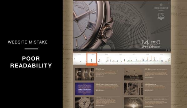 Google fonts have grown by leaps and bounds in recent times; therefore people are increasingly using different fonts. They are wonderful but still lacking in varieties because of the presence of numerous business domains. The attractive font is used to make the content impressive and what better than the Google font.
Infinite scrolling is not necessary
 Gone are the days when infinite scrolling ruled the roost in the past. Instead, people like to click on the link and access the content because it is a far better option than traveling to the bottom of the page. Eliminating the same from the web page is essential to enhance the user experience.
No to text-heavy sites:
 Visual storytelling has replaced the block of text or paragraphs as images speak louder than words. Users avail rich content experience including text, images, and interactive videos.
SEO copywriting:
 SEO copywriting has become ineffective as the search engine algorithm changed to a great extent. Gone are the days when keyword stuffing fetched higher results on the Google page.
No to old school pay per click:
 2017 is witnessing the arrival of contextual advertising instead of pay per click. In short, it is now possible to target specific customers who are more likely to buy the products and services.
About The Author:
Alana Berge is the writer here. She is working for Awebstar, which have created the stepping stone for Website Designing Singapore. She has been in Web development for more than 5 years. She loves all things having to do with PHP, MySQL, CSS, AJAX, or jQuery.




Leave a Reply