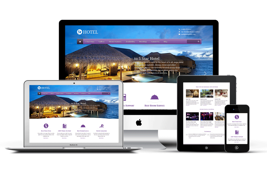
WordPress is the number one content management system in the world, and for good reason. It is diverse, has an incredible support base, and makes it very easy to come up with a good website with little to no prior coding experience. That said, while content management and overall handling has never been easier thanks to WordPress, you will find that actual design in terms of responsiveness and functionality is rather difficult. Responsive design must be your number one priority to ensure that your site renders perfectly on a multitude of devices which have different screen sizes and resolutions. Here’s how you can go about it.
Start Off with a Responsive Theme
One of the biggest pros of WordPress is the availability of thousands of great themes right off the bat. By selecting a responsive theme that is flexible and customizable from the very beginning, you will be able to make your website perfectly responsive for any and every screen. Choosing the theme is an important task because it is something you will have to stick to for the foreseeable future. It should look fantastic and be easy enough to modify to suit your purpose. Speed is an important consideration; a theme that is too heavy in terms of files and images might take a long time to load and will slow down your entire site.
Make Your Current Theme Responsive
If you are using a theme which you don’t want to give up, you can work on making it responsive. Some of the ways to do this are:
Fixing up media queries
A single stylesheet for the theme is used on both the desktop and mobile versions of your site, which means you will have to delineate the appearance for different screen sizes. By setting a maximum width for a set of styles, you can use a query akin to @media screen and (max-width: 480px)
Handling Images Effectively
Large images might spill out of your containers. This can be handled by adding themax-width:100%;,br/> attribute to the “body img” element in your CSS. Another way to do this is to upload different image sizes and having your code select which one is loaded.
Text Sizing
Text might appear huge on a smaller screen. This can be adjusted by using this code:
font-size: 60% and line-height: 1.4emin your CSS for the body.
Other Elements
You will also have to look into the sidebar, widgets, footers, and the content itself. You could switch to a drop-down box instead of a navigation bar for smaller screens, or make it resemble an app by keeping your navigation menu as an entire page. Read more about these on Tayloright.com.
Plugins
Plugins are a quick fix and a viable solution if your site is not too geared towards graphics, which makes it a good call for business or personal blogs and news sites. The WPTouch plug-in is a good fit here because it works wonders in restructuring your existing theme and making it more responsive. You might also want to look into the Fluid Responsive Slideshow, Page Builder, and Sinking Dropdowns plugins.
Conclusion
In a day and age where more users access the internet from mobiles and tablets than from computers, responsive design is a must-have for any site that hopes to succeed. With these simple steps, you should be able to get the wheels turning on your functional responsive website.
About The Author:
Maria Jones is a front-end developer and blogger based in New York. Having developed websites on WordPress, Drupal, and Joomla for several businesses, she is very familiar with the online marketing scene and also recommends ace services like Tayloright.com on her blog.


Leave a Reply