People tend to believe that landing page is easy to create. Just slapping some texts here and there, adding a call to action button and some cheesy Stock images to complement the text and a landing page is in the making.
But sorry to say this is not how a landing page born. Landing pages when done right take loads of hard works, calculation, and perseverance and of course creative inspiration. As most people believe otherwise, we have these half-backed landing pages that contribute to the desperation of the marketers emanating from low ROI.
To give you a fair idea how people are designing scary landing pages, here we are going to round up of top 7 mistakes that are playing spoilsport with the conversion rate:
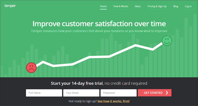 Temper has a cool and highly engaged headline.
1. You have a boring Headline
It is the headline of the Landing page that captures the attention of the audience first. So, you have to try your level best to make the headline looks captivating and convincing. Since it is your first and last chance to communicate with your targeted audience, you have to use simple English. Direct approach may prove effective in this regard. Some elements of surprise and curiosity may help you keep the visitors hooked on to your page.
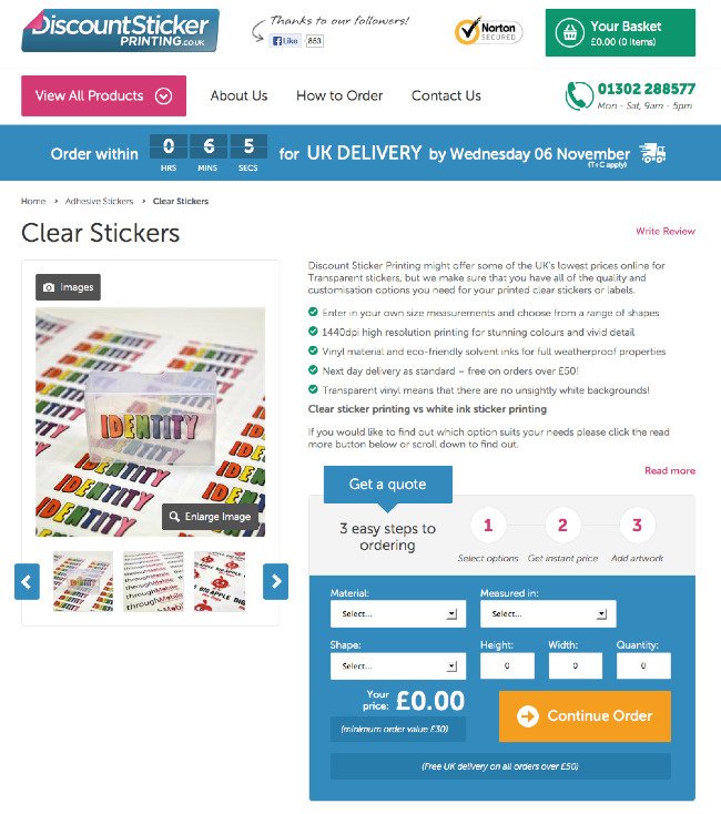 Clear Stickers section of Discountstickerprinting.co.uk website has well structure and persuasive content that helps increase its conversion rate.
2. Your Copy Sucks
Well, nobody is asking you to hire a Shakespeare to get your website copy written. But that does not mean that the copy will contain myriads of grammatical mistakes, sentence formation errors and other typos.
A great copy contributes to the success of a landing page. It encourages the visitors to complete the conversion. Therefore, the copy has to be assertive rather than passive and it should make a compelling case why the visitors should be option for your offer.
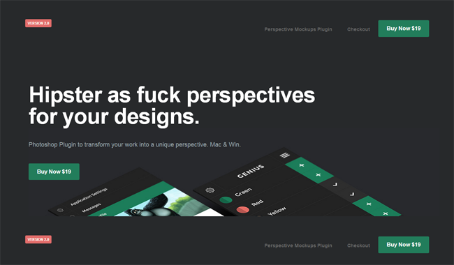
We must say that the Value proposition of Perspectivemockups is quite clear.
3. What Value You Are Offering
Ask yourself first why people should be buying your products? What value you are offering to them? Use simple and jargon free English to describe your value. ‘Value’ of your product/service can be anything. It can be ‘fast delivery’, ‘free shipping’ or ‘competitive prices’. Whatever the ‘value’ is, make it crystal clear to the targeted audience.
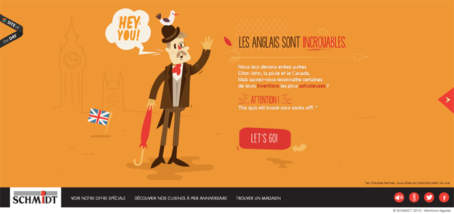
Call To Action Button of Une-cuisine-astucieuse.fr is prominent and the contrasting color helps it locate easily.
4. Unimpressive To Call To Action
The purpose of the Call to Action is to encourage people to click on them and convert. So, do not let it get overshadowed by other designing elements. Make it look prominent by using different color combination, using different fonts or using any other similar techniques.
For god’s sake do not use generic words like – ‘Click here’, ‘More Info’ for ‘Call to Action button’ because this does not give any concrete information as it what the purpose it will serve. If the CTA button takes them to payment page, use word like ‘Buy Now’, ‘Make Payment’ etc.
5. People Hate Stock Images
I have no idea why people still use stock images for their product landing pages. Apart from their aesthetic appeal, these stock images do not serve any purpose. Wait, yes they serve one purpose – they kill the conversion! These images are used everywhere and lack credibility.
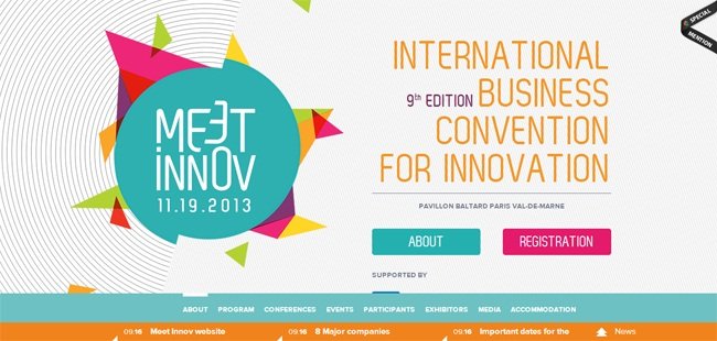 Meetinnov has used two Call to Action buttons but they are easy to locate and do not affect conversion rate negatively.
6. Too Many Offers Kill The Prospect
As the saying goes – ‘too many cooks spoil the broth’, you have to be careful that you are not adding too many Call to Action buttons on the landing page. Research shows that the number of CTA buttons and conversion rate is inversely proportional. So, if possible, try not to add more than one CTA button on a landing page.
7. Trust Factor
Since people are going to part with their hard earned money, you need to assure them that they are in good hands. You need to feature testimonials of some ‘real’ people on the landing page.