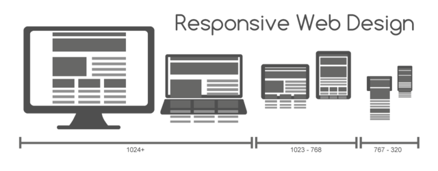
 Increasing usage of web over mobile devices has led to the rise of responsive web design (RWD). In order to create a truly responsive design, you first need to understand that it is not just a single technology and rather consists of a set of techniques, allowing web pages adjust to respond to the user’s context. However, one technique that often creates a problem in making a web design responsive is making the images fluid. In simple words, the hardest part of RWD approach is to implement responsive images.
Wondering why?
Since images are not fluid naturally, their size and orientation remains the same in various viewport configurations. And so, when images are cropped, they often become large in size compared to their container size. This often creates a challenge to display images in any mobile browsers: as the native size of the images remains the same, images are either cut off or are displayed exceeding the surrounding text in a web page as it narrows.
So the question is how we can make the images fluid or responsive? Through this post, I would like to discuss about a few solutions for creating responsive images with help of CSS.
Creating a Simple Fluid or Responsive Image
To create a responsive image, the very first thing you can do is size images according to a percentage-length or relative-length unit, instead of pixel dimensions. And the most widely practiced relative solution requires setting the image to max-width i.e. 100%, as shown in the CSS code below:
img {

max-width: 100%;

height: auto;

}
The img element is assigned CSS max-width property, so that the image is displayed according to the native dimension till the time it fits within the HTML container. Now, when the browser window narrows image will scale to adjust itself according to the window.
Though this approach works well, but it has some shortcomings too:
- When the viewport reduces in size, the image with native size greater than the width of small-screen devices (or a Smartphone) will start dominating the document. In this case, the image will scale, making it larger in size compared to text when viewed at small sizes viewport.
- Since the image’s height and width are not set in the CSS explicitly, the browser won’t preserve any space for storing the image. And as a result, the image layout will explode (i.e. exceed the page or device screen), as fluid they’re made to fit into new sizes.
- This approach won’t work for “Retina images”, till the image native size is equal to the full-width of its container.
Though setting the image to max-width is a good approach for adding responsive images in the header section of a web page and for article with “hero” images, however, to add responsive images in body text requires following a better (and rather a complex) approach.
A Better Approach to Implementing Responsive Images
Now let us talk about a better approach to making images responsive. For this purpose, we simply need to measure the image width in terms of percentage of the web page overall width. Let’s say for example, you have an image with native size of 400px × 200px in a document that is 1100px wide. So, the document will be responsive below 1100px. You can calculate the percentage of width that the image takes up: (400/1100) × 100 = 36.36%
Using this measure, you will get the width of your image plug; next set the image width inline, as every image will have a different dimension:
img {

float: right;

width: 41.66%;

margin-left: 2rem;

}
Using this approach will help keep your images in sync with the rest of the text, thereby making them responsive. In fact, this is a good approach for adjusting retina images according to different viewport sizes. However, the retina pixel-doubled images may encounter problems when accessed on viewport with extremely large or small sizes; the image will probably look too big or small compared with the text. To resolve this problem, you can assign the image a “max and/or min” width in pixels:
img {

float: right;

width: 36.36%;

margin-left: 2rem;

max-width: 400px;

}
Let’s Wrap Up!
Responsive images are a crucial component of a responsive web design. Irrespective of how much time and efforts, we’re putting in to create a responsive design, everything will go in vain if we are unable to make the images fluid or responsive (i.e. adjustable on mobile browsers). However, making images responsive has been a challenge for most of the designers. There’s no right way to implement responsive images in a web design, and it is important for you to carefully search the Internet for finding the right solution. However, this post will serve as a basic guide in helping you understand the significance of responsive images and how you can create one using CSS.
About The Author:
This post is brought to you by Samuel Dawson, working as front-end developer for Designs2HTML Ltd. a leading PSD to HTML conversion company and he shares concrete information, latest trend & tips on front-end development technologies.


Leave a Reply