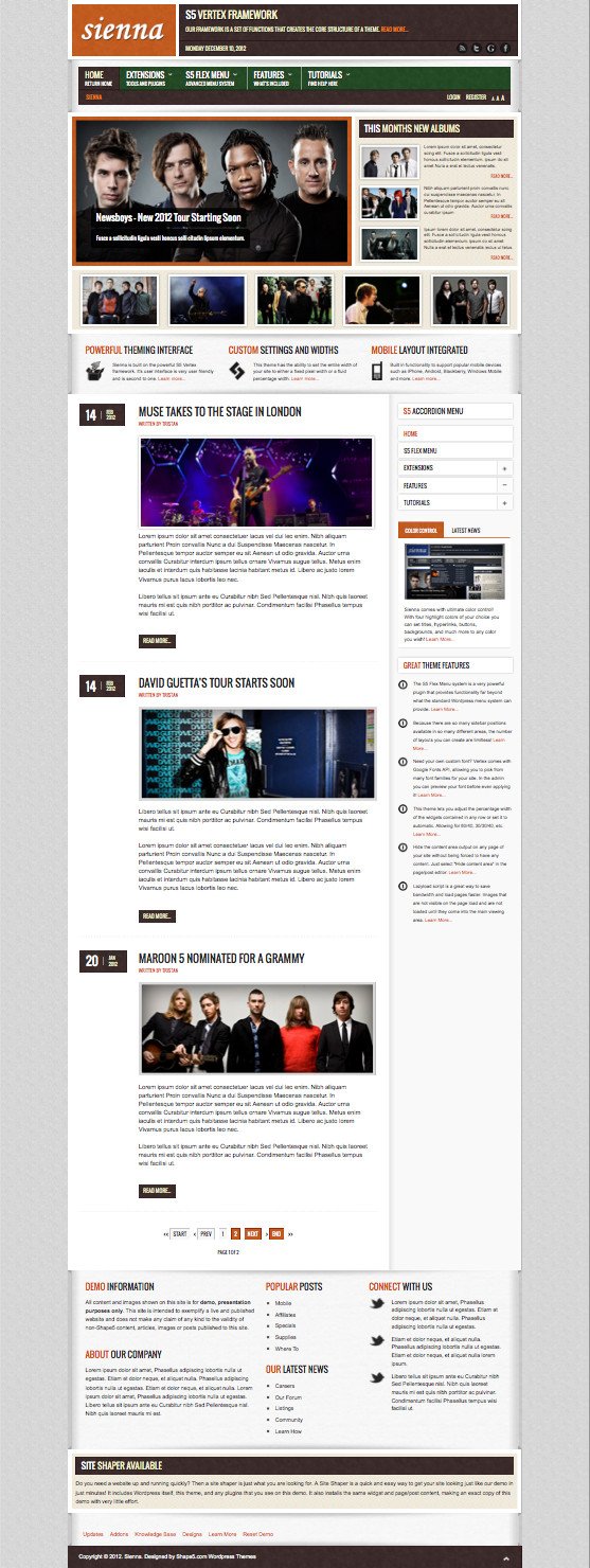
Sienna is recently released a fresh responsive WordPress Theme from Shape5 Developer club for the month of December 2012. Sienna WordPress Theme has been designed with plenty of new unique features and design to use on different kind of industry websites like online magazine, business services, corporate, photography, portfolio, freelancers, news updating websites and etc. This theme comes with 4 unique preset highlighted colors and custom color options as well. Sienna is a responsive design that support for all kind of mobile devices like iPhone, iPad, Tablets, BlackBerry, Windows mobiles and Android devices. It is powered on S5 Vertex Framework, which helps to create core logic and structure functionality of a theme as well as you will see CSS and HTML Layouts, supported for popular web browsers that included mobile browsers, Mobile Device Ready, Lightweight and fast loading experience which is also boosting ranking in the Search Engine rankings like Google, Yahoo and Bing. The backend admin panel has option to customize the layouts, text options, uploading own logos, flex menu as you wish the way to display with/without icons, Upgradable Framework that makes your website very secure from the hackers, Google font settings, font sizer, RTL support and much more…
Sienna WordPress Theme has been featured with 93 positions that can be used from the Widget section by drag-n-drop the desired widgets, 8 class suffixes for styles, S5 Tab Show, S5 Accordion menu (Drop down tab with 6 positions), Side tabs for linking and popups and etc. The normal view of demo come up with homepage featured image slider for showcase/display recent articles from specific categories, the top navigation bar comes with social media profile buttons for Facebook, Twitter, RSS, Google+ and Pinterest, the footer section is totally unique display the different information such as company information, contact location with integrated Google map, popular posts, twitter stream and much more. The following WP plugins are used on the demo:
- S5 Accordion Menu – Accordion Column Menu
- S5 Flex Menu – Advanced Menu System
- S5 Box – Popup Box For Login
- S5 Tab Show – Sliding Tab Widget
- S5 ImageSlide – Image Rotating Widget
Site Shaper Setup is available to save your time and it is Highly Recommended for new beginners. It is loaded with demo that can be easily replaced with, as you desired contents without changing any additional settings of current demo. This theme is complete unique design in WordPress industry! Check out the additional features and demo screen shot below:

Sienna WordPress Theme Unique Features:
- S5 Vertex Framework Platform
- 93 collapsible core template positions plus 4 mobile positions
- 8 custom module suffixes
- 4 custom highlight colors
- Enable/Disable uppercase letters
- Custom logo sizes
- S5 Flex Menu integrated
- Choose fluid or fixed template widths
- Custom column, page and row widths
- Mobile Device Support
- Designed with CSS3 – Limited support for IE7 and IE8 through PIE
- RTL language support
- Google Fonts
- SEO optimized
- Fixed tabs
- Menu scroll to section
- Site shaper available (WordPress install that includes demo data)
- PSDs included
- Multibox enabled
- Tool tips enabled
- 100% tableless CSS
- Validates with XHTML 1.0 Transitional
- Validates with CSS Level 3 with browser specific calls
Compatible with the following browsers:
- IE7+
- Firefox 1.5+
- Opera 9+
- Safari
- Advant
- Chrome
Tutorials Included:
- Site Shaper Setup
- Installing The Theme
- Setting Up Widgets
- Configuring The Theme
- Search And Menus Setup
- S5 Box Login & Register Buttons
- Multibox Setup
- Tooltips Setup


Leave a Reply